
Nowadays, many people claim that they are proficient in using Microsoft Office, but when it comes to Excel particularly, it’s not easy to use if you are not someone technically sound. Graphs are used everywhere to get a clear depiction of the data and to make decisions by understanding those data. In graphs, you make use use selected data.
When you want to change the graph, you have to change the values present in the X-axis and Y-axis, which is quite tricky for people who don’t know how to manipulate the values of the axis. Though it’s a very simple process to change the values of the X-axis in Excel, many people still find it tricky. Here in this article, we will learn about the different methods by which we can change the values of X success in Excel.
Ways To Change X-Axis Values In Excel
Excel charts are simple. If you understand how it works. Here we have the X-axis and Y-axis. The X-axis is horizontal and the Y-axis is vertical. When you try to change any value in the X-axis that is horizontally you are changing the categories within it, one can also change the scale to get a better view. We use the horizontal axis to display text or dates at various intervals. This horizontal axis is not based on numeric like the vertical access.
We use a vertical axis to show the corresponding categories’ values. One can use any number of categories by keeping in mind the size of the chart. If you’re working with a lot of data, it is better to split it into multiple charts. Here are some ways to work with the x-axis.
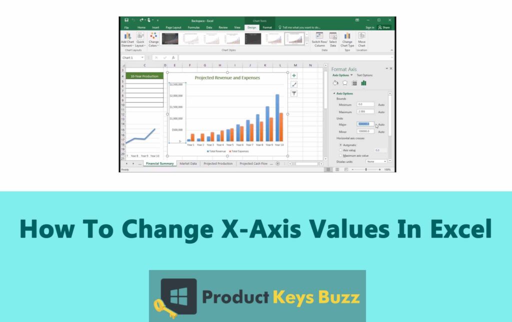
Method 1: Use Right-Click To Change X-Axis Values
- Open the Excel sheet, where you want to change the value of the X-axis.
- Right-click the X-axis of the graph. It will now open the menu options.

- Click on the option Select Data and it will open a new window.

- Under the Category that is Axis Label, you will find an Edit button. It will open a small window named the Axis Labels.

- Click on the highlighted button to select the desired data range for the X-axis.

- After you have selected the values you need to press Enter or click again on the same button.

- Proceed by clicking on the OK option and the values present on the X-axis of the graph will change depending on the X-axis values.

Method 2: Edit The X-axis
- Open the Excel file where you want to make the changes.

- Click on the graph with the X-axis where you want to edit.

- Pick the option Chart Tools.

- At the top of the screen, you will find the option Format. Click on it.

- Choose the option Format Selection which is located under the option File that is present near the top of the screen.

- Click on the option Axis Options then followed by Values in reverse order. It will change how we are numbering the categories.

- If you want to make changes to the X and Y axis merging point then select the option Axis Options. It will adjust the maximum value. From here you can change the spacing of the chart and change the interval of the tick marks.

Chart Specific Terminologies
There are multiple features of Excel charts. The chart is the most useful part of using Excel and is very important when it comes to analyzing data. Businesses nowadays focus only on how the data is represented using charts and graphs and make informed decisions based on that. So here is some specific chart terminology that you should be aware of.
X-Axis
Be it a two or three-dimensional graph the X-axis is used to represent the horizontal axis. It helps to show independent variables like time, periods, or the categories against which things are measured. We can change how the graph looks by manipulating the data on the X-axis.
Y-Axis
The y-axis is the vertical axis, which is used to represent the dependent variable or quantity and helps in showing the data that you are trying to track. When you change the X-axis data, it also changes the Y-axis of the graph.
Graph Vs Charts
Not many understand, but graphs and charts are two different things. When a chart is used, it is used for visual representation of two or more variables, whereas a graph is a type of chart.
Plot Area
Plot area is the space where the data is plotted. If you’re using a plot area on a 2-D chart, then it will contain gridlines, trendlines, data tables, data markers, and other chart items that are optionally placed in the chart area.
Legend
Legend is used for providing information about the tracked data. It enables the viewer to understand and read the graph. A legend is also called a key. Legend is very useful when it comes to having more than one line.
Chart Area
The chart area on a 3-D chart will contain the chart title, the legend, the axis titles, and the axis. If you’re using the chart area on a 3-D chart, then it will contain the legend and chart title.
Final Words
These steps will allow you to work with the x-axis and manipulate the data and graph accordingly. Excel does require time and effort to master it. By following the steps above you will understand how X-axis works in Excel.
In Excel, one can find myriads of features. If you want to enhance how the graph or chart is looking, you can manipulate more data in both the X and Y axis and see how it is changing the way the graph is looking.
Table of Contents